Earth and Climate Science Problem
Mimamsa 2026
Problem Statement
Given below are three graphs that show the average intensity of radiation versus the wavelength of radiation; as seen from the top of the Earth's troposphere. The smooth curves are theoretical emission spectra of blackbodies at different temperatures. The jagged line is the spectrum with the greenhouse effect of only CO2 taken into consideration.
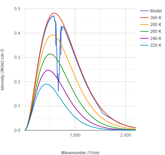
Fig 1: 10ppm CO2
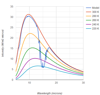
Fig 2: 100ppm CO2
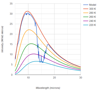
Fig 3: 400ppm CO2
Note the dip in intensity at ~15 microns, corresponding to IR radiation.
- Why does the emission temperature have a lower bound? What affects this temperature?
- An isolated stationary CO2 molecule absorbs IR radiation in a very narrow range of wavelengths. Why does the increase in concentration cause a broadening of the dip in the absorption spectrum?
- How would the profile of the dip in absorption differ in the thicker (higher pressure) Venusian atmosphere?